Choosing a paint color seems simple—until you’re staring at 30 shades of beige. The truth is, color plays a powerful role in how a room feels, functions, and even how it’s perceived by future buyers. For homeowners looking to update or stage their Temecula property, understanding how to choose paint colors goes beyond style; it’s about creating a home that feels just right.
Start With Purpose, Not Just Preference
Before picking up swatches, ask: What is this room used for? The function of the room should guide your color choices.
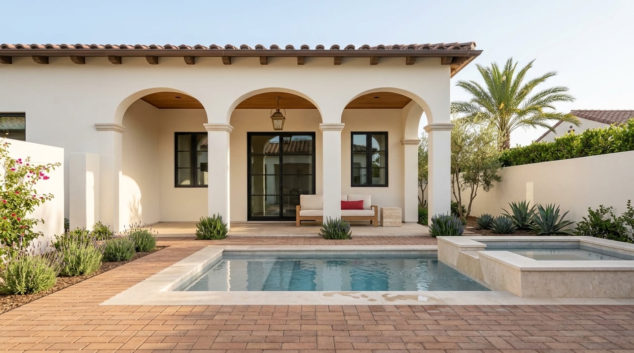
- Living Room: This is often the heart of the home—a place to relax and entertain. In Temecula, where many homes feature open, sunlit living areas, warm neutrals like soft beige or greige (gray-beige) strike a perfect balance between cozy and bright. Muted greens or warm earth tones also work well with the natural surroundings.
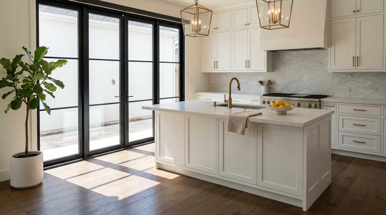
- Kitchen: The kitchen should feel clean, functional, and welcoming. Whites, creamy tones, or soft sage greens look fresh and modern, especially when paired with light countertops and wood or tile flooring, which are common in Temecula homes.
- Bedrooms: These are personal spaces meant for rest. Cool colors like dusty blue, muted lavender, or gentle greens promote calm and sleep. Keep the tone soft and soothing, especially if the room gets intense afternoon sun.
- Bathrooms: Lighter, airy shades like soft gray, powder blue, or warm white work well in bathrooms, helping the space feel larger, brighter, and more relaxing, almost like a mini spa retreat.
- Home Office: The right color can make all the difference in a workspace, especially if you’re spending long hours working from home. Shades like muted blues, olive green, or soft, grounded neutrals create a focused, calming atmosphere that supports both productivity and comfort. The goal is to strike a balance: a space that feels peaceful without being dull and energizing without being distracting.
At the end of the day, choosing paint is about how you want each room to feel and function. Keeping that in mind makes the decision process a whole lot easier.
Let Light Be Your Guide
One of the biggest mistakes people make when choosing paint? Ignoring natural light. In Temecula, where the sun is strong and ever-present, understanding how light interacts with color is crucial.
- South-facing rooms get steady, warm light all day—most colors look true here.
- North-facing rooms have cooler, softer light—warm tones like taupe or creamy white work best.
- East-facing rooms are brighter in the morning—warm neutrals help maintain balance as light fades in the afternoon.
- West-facing rooms get golden evening sun—cooler tones like soft blue or gray can offset the warmth.
Before committing to a color, test a few swatches on different walls and look at them throughout the day. A gray that looks perfect at noon may appear blue or purple by evening.
Keep It Flowing: Choosing Colors for Open-Concept Layouts
Open-concept homes are common in Temecula, with many floor plans blending the kitchen, dining, and living areas into one continuous space. In these layouts, color should help define zones without making the space feel choppy.
The key? Use a cohesive color palette. Start with a main neutral that can carry through the core of the home—something soft and versatile like a warm gray or creamy white. Then, add subtle contrast with accent walls or trim in complementary tones. For example, a muted clay or slate blue can be a great visual anchor in a dining area or reading nook.
Keeping tones in the same color family (warm with warm, cool with cool) ensures that transitions between spaces feel natural.
Watch the Undertones
Two shades of gray might look similar on the swatch, but once on the wall, one might look blue and the other brown. Why? Undertones.
Every paint color has a hidden hue—its undertone—that becomes more visible when paired with other colors or exposed to certain lighting. That’s why one “white” may look yellowish next to your cabinets, while another looks crisp and clean.
- Warm undertones (yellow, red, orange) pair well with wood floors, cream accents, and cozy décor.
- Cool undertones (blue, green, violet) work best with modern finishes, stainless steel, black-and-white themes, and coastal style.
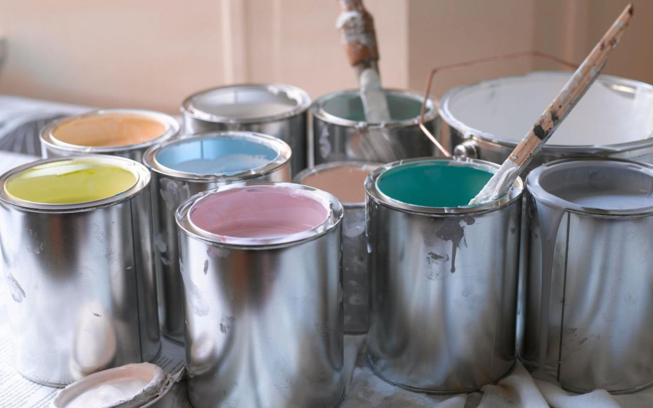
To avoid surprises, always test large swatches on your walls before painting the whole room. Be sure to test them next to permanent finishes—like your flooring, countertops, or cabinetry—not just in isolation.
Thinking About Resale? Stay Timeless
If you’re updating your home with resale in mind, neutral tones are a safe and strategic choice. Buyers want to imagine themselves in the space, and bold or ultra-personal colors can be a distraction.
Light grays, soft whites, taupes, and greiges tend to appeal to the widest audience. They reflect Temecula’s sunny vibe while making interiors feel fresh and move-in ready. A subtle accent wall or colorful bathroom is fine, but the main living areas should feel versatile and clean.
Design Tips for Choosing Paint Like a Pro
Start with fixed elements: Match your paint to what’s not changing—floors, countertops, tiles, etc.
- Use color samples generously: Test in natural light and artificial light, and view swatches vertically, not lying flat.
- Limit your palette: Stick to 3–5 coordinating colors throughout the home to keep things cohesive.
- Don’t ignore ceilings and trim: Crisp white trim can make wall colors pop, while a soft ceiling color can warm up a room.
Thinking About Selling or Upgrading? The Meeker Realty Group Can Help
Whether you're preparing to list your home or simply want to make smart updates, choosing the right paint colors is one of the most effective ways to enhance your space, both visually and financially. A fresh, well-chosen palette can make rooms feel brighter, more spacious, and more appealing to potential buyers.
If you're considering selling or want expert insight into which updates add the most value in Temecula, connect with the Meeker Realty Group. Their deep local knowledge and eye for design can help you make confident, market-savvy decisions that pay off.